
Hub & other brands
“Hub” is Core Space’s original brand - it’s bread and butter. Each student housing building in the Hub brand has an individualized shield logo and its own colors. Using the brand’s simple and bold line drawing style, I depicted a dock for our College Park property to convey the relaxed feel of the property. The selected colors reinforce this idea with easy, natural tones and an unexpected bright orange, to maintain a youthful impression. I have interpreted this brand onto a range of collateral, from large scale window wraps to social media stories.
Brand DESIGN
Logos, colors, vibes—let’s make it make sense.
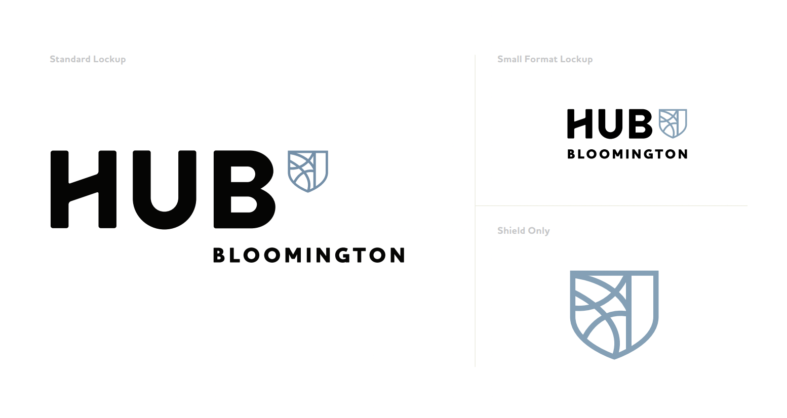
Hub Bloomington:


AVOn
OBJECTIVE: The objective was to identify the essence of a dying or defunct brand, and then transforms it by providing a new direction. I chose Avon. Avon Products, Inc. is a multi-level marketing company in beauty, household, and personal care categories.
APPROACH: As a women centric brand, Avon has been a well established brand by itself. I approached the rebranding by identifying outdated elements, and researching on what the current audiences expect out of a beauty brand. Below is the design process used to arrive at the logo, and aesthetics of Avon.
RE-BRANDING OBJECTIVE: The Re-branding objective is to “build a community for women to encourage and support them”


Other in-house branding


